Mel has worked on hundreds of creative projects in the past 14 years ranging from design research, branding, logo design, layout, infographics, illustrations, animated videos, and more.
With her experience as a creative director and leader of a team of 16 at the company she founded, Design de Plume, Mel has worked with clients in the following sectors: not-for-profit, government, education, health care, business, and Indigenous communities and organizations.
As a former educator in the graphic design program at Cambrian College, and as the current coordinator of the Incubator Program at the Innovation Quarters, Mel continues to demonstrate her passion for leadership, mentoring, and creativity for all industries.
Key Projects
Branding of the Office of the Commissioner of Indigenous Languages
About the OCIL Brand
The OCIL's mission is to promotes and champion all Indigenous languages in Canada and supports Indigenous Peoples in the reclamation, revitalization, strengthening, and maintenance of their languages. Their goal was to brand themselves with a modern design while recognizing the diversity within Indigenous cultures in Canada. The final brand reflected the following messaging:
Their Interconnected vibrant quadrilateral shapes brought together at the centre represent the three Indigenous groups: First Nations, Inuit, and Métis. The colourful motifs around the edges are inspired by ribbons, woven strands, and stitched fabrics found in Indigenous crafts and clothing. The 12 ribbon shapes around the logo symbolize the spoken language groups which makeup over 70 Indigenous languages in Canada. The expanding, energetic lines create a sense of movement, showing how languages are a living gift shared and celebrated in every direction across Turtle Island and Inuit Nunangat.
Project Role
Creative Director, design research, branding direction and brand guide creation along with assets, website direction, and client creative contact management. Created by Design de Plume, while Mel was a founding partner.
This design won an 2023 RGD's Branding Awards - Integrated Award category
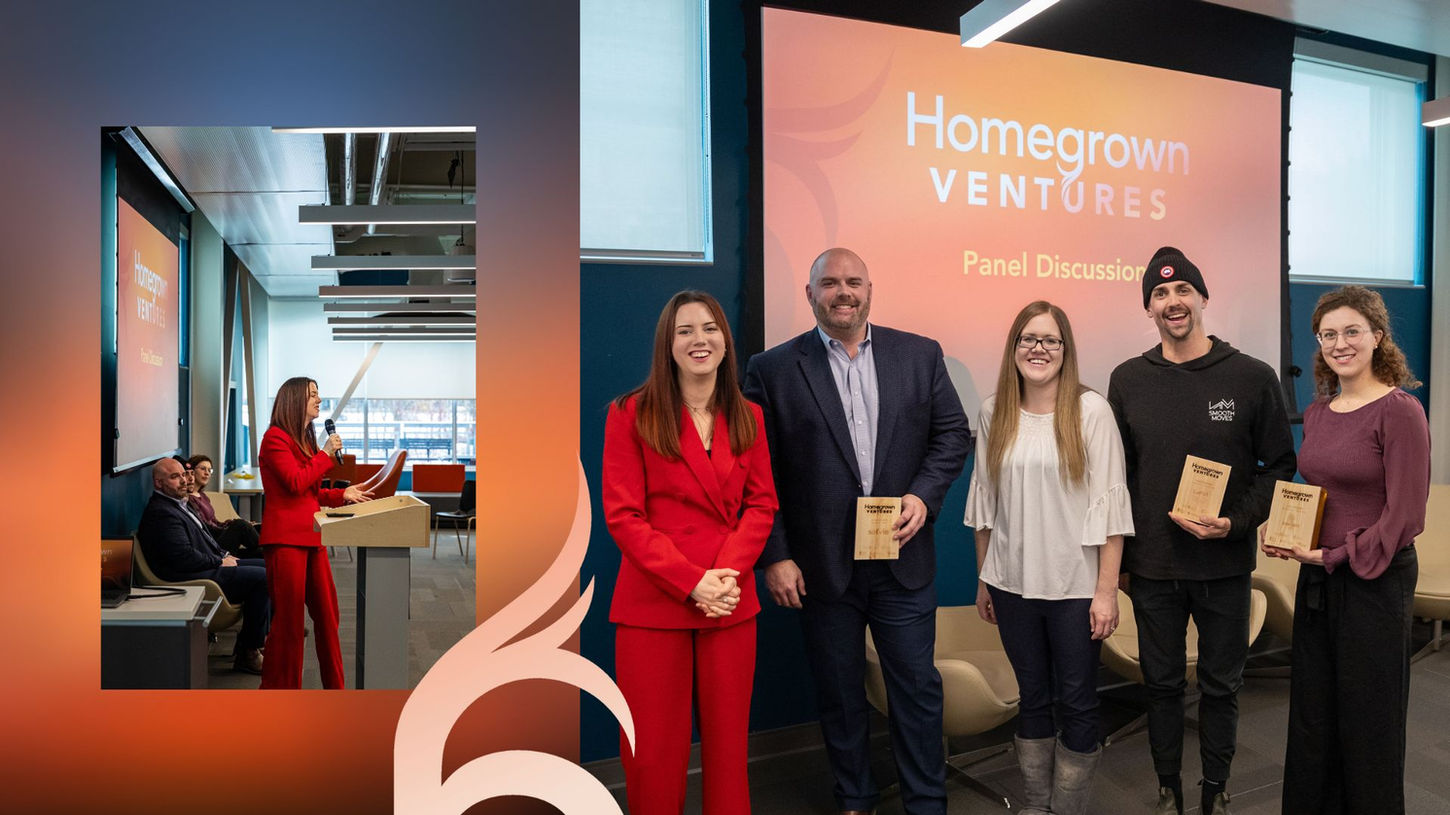
Event branding for Homegrown Ventures with the City of Greater Sudbury and Laurentian University
About Homegrown Ventures
Homegrown Ventures is a entrepreneurial showcase highlighting the growth and success of entrepreneurs who have settled their roots in Greater Sudbury. This event was co-organized by the Innovation Quarters, the Regional Business Centre with the City of Greater Sudbury, The Foundry, and the Jim Fielding Innovation and Commercialization Space located at Laurentian University.
The event took place on February 27th 2024 with the goal to make it a yearly occurrence. The logo was designed to look like roots, to represent how deeply rooted the entrepreneurial community is in Greater Sudbury while the colour scheme was inspired by a sunset over the Big Nickel.
Project Role
Event organizer, name and brand designer, designer of printed assets, speaker coordinator, MC, trophy designer. Created in my current role as Coordinator of the Incubator Program at the Innovation Quarters
- Event photos provided by Chris Taillefer Photography
Read the city press release for more details about Homegrown Ventures 2024.
Rebranding of the Center for Indigenous Health with John Hopkins University
About the Centre of Indigenous Health Rebrand
The Center for Indigenous Health was founded in 1991 and based at Johns Hopkins Bloomberg School of Public Health in the United States, the largest and #1 ranked school of public health in the world. They reached out in 2022 looking for a new name and brand that would be more inclusive, gender-neutral, and reflective of their world-wide services and offerings.
The logo design was inspired by elements of importance across Indigenous communities, including the drum, weaving, and nature represented in the sun, leaves, and stars on the perimeter. The graphic illustration’s center forms a “+” shape, a widely recognized symbol for medicine and health, representing the blend between traditional medicine and western health sciences.
Project Role
Creative Director, design research, branding direction and brand guide creation along with assets, website direction, print material and illustration direction. Created by Design de Plume, while Mel was a founding partner.
Read more about the rebrand and renaming announcement with John Hopkins University.
More Work
E-Alliance Branding


E-Alliance is a knowledge sharing hub made up of scholars and partner organizations from across Canada who are dedicated to gender+ equity in sport. Their brand and website were designed as gender, and ability inclusive while embodying motion and team unity.
Mel's role in this project was of creative director and designer along with client management in both French and English while a partner at Design de Plume.

Western University


Located in Western University, the REACH and CEDAR programs offer innovative healthcare learning which include culturally inclusive workshops, training, and planning.
The earth-toned brand was created as a system meant to grow as new programs came to be.

NWAC


Over a period of 7 years, Mel had the opportunity to work with the Native Women's Association of Canada on dozens of projects including rebranding their main identity, and several other key divisions including the 2SLGBTQ+ Unit and the Safe Passage project raising awareness against human trafficking.

Design
From brand creation to illustration, let's create your story.

Special Olympics Canada
Working closely with our friends over at Special Olympics Canada, the Inclusion in Sports series was created as educational ressources for coaches and volunteers. A series of inclusive and diverse illustrations were also created with feedback from SOC at every step.


